Lesson 51
To Frame or Not To Frame.
The Window on the World and the Object.
“Works of art make rules; rules do not make works of art.” Claude Debussy
Conventions are too readily observed without question and also discarded without understanding what they do or why they were employed in the first place. There is nothing wrong with breaking the rules but you need to know what the rules are before you break them and you also need to be able to articulate why you wish to break the rules. I remember a student exhibiting photographs vertically, threaded on a string; the student did not know why they had done this and it did make the photographs difficult if not impossible to look at. Nothing wrong with play but you need to reflect upon the results of such experimentation. I explained that there was a reason why photographs are conventionally exhibited, either on the pages of a book or a line at eye level on a wall. I presumed that the student adopted their unusual form of presentation to get the audience to view the work in a different way, but unfortunately the student did not understand this and one can only presume that the presentation was for novelty, to be original and controversial for its own sake. Currently there are more ways acceptable of arranging works on the wall in an exhibition than simply in a straight line at eye level, such as grouping work or ‘skying’, as familiar at the Royal Academy Summer Shows. However, I believe you have to have a clear reason to move away from the single line of works at eye level other than just novelty. In all this the fashion for innovation for its own sake should not dictate.
“Grouping” as with this collection of Alfred Wallis’ paintings has now become conventional. [Thumbnail images]
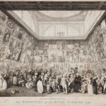
“Skying” work is not new as we see in this print of the Royal Academy Show of 1787. The distinction of paintings above and below the ‘line’ can clearly be seen. More often than not this form of arrangement looks like a jumble sale.
Similarly, frames have a purpose – they make a distinction between the spatial illusion of the painting and the wall. The frame is a border and separates the flat surface of the painting with the similar morphology of the wall.
The rule would be that figurative paintings and referential works that have perspectival or a naturalistic and conventional depth – the ‘windows on the world‘ – need a frame. Whilst abstract works, the painting as an ‘object’ do not, as no boundary is necessary between the flatness of the painting or the monocular depth cues employed and the flatness of the wall, the spatial illusion being of a different order and type to the ‘window on the world’.
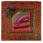
Of course this is a generalisation and not everything fits into these categories. There are variations on these ‘rules’. Many paintings can be seem as both ‘windows on the world‘ and as objects. These works are framed in particular ways; for instance in Francis Bacon’s work the painting is set into a large box frame behind glass. It is unusual to put a large oil painting behind glass and the reflection can make the painting difficult to see. The box frame encompasses the painting, and it is as if the painting was on a wall, unframed, yet framed. Bacon’s paintings are both framed and unframed. Like a precious object in a museum case. Or as Harold Hodgkin when he paints the frame, these seemingly abstract paintings are referential and have a pictorial space (Hodgkin has referred to early childhood experiences of looking out of a window). The painting leaks out onto the frame, making the frame and painting part and parcel of the object. In Hodgkin’s work the frame is less of a border between the painting and the wall. Hodgkin claims he is not an abstract painter, thus the frame enables the paintings reading as referential, as does his titles.
Rainbow Howard Hodgkin painted frame
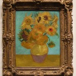
Getting the correct frame can be difficult and frames can mean important things in their own right. I hate all those Impressionist and Post Impressionist paintings framed using heavy ornamental baroque gold frames. Ornate baroque frames are fine for baroque paintings, like Rembrandt, but Impressionist and Post Impressionist paintings require simple (white) wooden frames. The fancy gold frame is intended to signify ‘Old Master’ and commercial galleries framed paintings by Cezanne and Van Gogh in the early 20th century using heavy ornate frames to make that Old Master statement, for these ‘New Masters’, hyping the work and elevating sales. The gold frames say that these are our new ‘old masters’. Unfortunately these frames are totally inappropriate and detract from the works: as stated in Lesson 23, frames should be unmemorable.
Gold baroque framed Van Gogh painting.
Currently there is a fashion for not framing figurative paintings. In some cases this is laziness, and in my own case it is financial, and choosing the correct frame can be difficult.
Painting on canvas is cheap, particularly if you can get away without frame. However paper, which would be seen a cheaper option than canvas is expensive as paper needs a frame. New inventive ways of presenting drawings can be employed such as bulldog clips, magnets or mapping pins.
For my degree show at the Royal College of Art in 1972, I exhibited etchings and other works on paper using mapping pins. Which said that the context of The College was ‘frame’ enough. This form of presentation was initially seen as unprofessional but later described as the most honest show that year in painting at the RCA.
George Shaw displayed drawings produced during his National Gallery Residency in the National Gallery, using drawing pins, presumably also feeling that the National Gallery was enough of a frame.
This entry was posted on Monday, July 10th, 2017 at 10:52 am
You can follow any responses to this entry through the RSS 2.0 feed.


